Understanding Calls to Action and Their Importance in Affiliate Marketing
A strong call to action (CTA) is what turns clicks into commissions. Without it, even the best content won’t convert. In affiliate marketing, a CTA tells people exactly what to do next (the final decision they should take in the end) whether it’s buying a product, signing up, or learning more.
I’ve seen weak CTAs cost marketers sales. A vague “Check this out” won’t cut it. You need clear, action-driven words like “Get 50% Off Now” or “Start Your Free Trial Today.” The right CTA makes all the difference. Clear and compelling calls to action can increase conversion rates.
CTAs work best when they match the audience’s intent. Someone ready to buy needs urgency, while a curious reader needs more info. A well-placed, well-worded CTA guides them smoothly.
Understanding how to craft the perfect CTA isn’t just helpful but also essential. Let’s break down why they matter and how to use them effectively.
“Buttons & Click-Boosting Calls to Action” is my favorite guide on this topic. If you want to learn more about CTAs, then consider checking it out.
Key Takeaways
- A CTA is the bridge between content and conversions. If you don’t tell people what to do next, they won’t take action.
- Clear, action-driven language increases clicks. Vague CTAs don’t work. Use direct phrases like “Get Started Now” or “Claim Your Discount.”
- Placement and design affect performance. A CTA must stand out visually and be positioned where people naturally look.
- Match the CTA to the audience’s intent. Some need urgency, while others need more details before committing.
- Testing and optimization improve results. Small adjustments like button color or wording can greatly boost conversions.
- A strong CTA turns passive readers into buyers. Without one, even the best affiliate content won’t generate sales.
What Is a Call to Action (CTA)?
In a simple definition, a call to action (CTA) is a direct prompt that guides people toward a specific action. It tells them exactly what to do next—click, sign up, buy, or learn more. Without it, most visitors will leave without taking any steps.
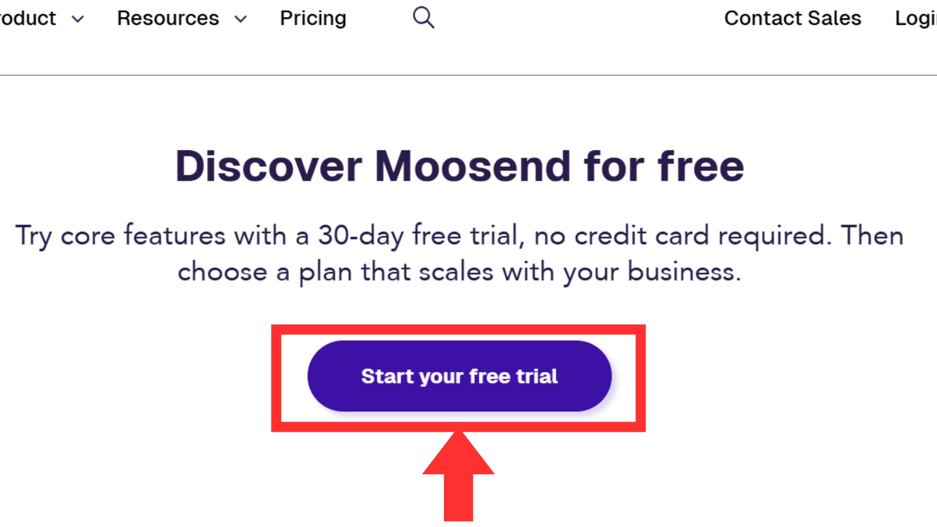
Here is an example of a CTA button:

In affiliate marketing, CTAs are essential. They push potential buyers toward the products or services you’re promoting. A strong CTA increases conversions, while a weak or missing one leaves money on the table.
CTAs can be buttons, links, or simple phrases in your content. They work best when clear, urgent, and easy to follow.
Common CTA Examples:
- “Buy Now” – Directs users to complete a purchase.
- “Sign Up for Free” – Encourages free trials or lead generation.
- “Learn More” – Gives curious visitors more details before committing.
- “Get 20% Off” – Uses discounts to push immediate action.
A strong CTA tells people exactly what to do next. Without it, they might hesitate, get distracted, or leave without taking action. When it comes to marketing, every click matters. A well-placed CTA eliminates confusion and nudges users toward the next step—whether that’s signing up, making a purchase, or learning more. If your audience doesn’t see a clear path forward, they won’t take one.
The Importance of CTAs in Affiliate Marketing
As I said above, CTAs are very important in affiliate marketing. CTA is the final push that turns a visitor into a customer. Without it, people may leave without taking action.
A clear and compelling CTA can mean the difference between earning a commission and losing a sale. However, not all CTAs work the same way. Some get ignored, while others drive clicks and conversions.
The key is crafting CTAs that are clear, urgent, and easy to follow. Let’s break down what makes an effective CTA and how you can create ones that actually work.
1. Drive Conversions
People don’t always act on their own. They need direction. A well-crafted CTA tells them exactly what to do next. Without it, they might read your content, feel interested, and then leave without clicking. That’s a lost commission.
A strong CTA eliminates that problem by guiding them to the affiliate offer. Whether it’s “Buy Now,” “Start Your Free Trial,” or “Get 20% Off,” a CTA gives them a reason to take action right away.
2. Improve User Experience
Imagine walking into a store with no signs. You see products but have no idea where to go or how to buy them. That’s how a website without CTAs feels. Visitors might enjoy your content, but without a clear next step, they’ll leave without engaging further.
A CTA acts like a signpost, guiding them through the process. If you’re reviewing a product, a button that says “Check Today’s Price” helps users move forward without frustration. The easier the experience, the more likely they are to convert.
3. Increase Engagement
CTAs aren’t just about making sales. They also encourage interaction. If a visitor isn’t ready to buy, you can keep them engaged with other actions like signing up for a freebie, watching a demo, or joining an email list.
This keeps them in your ecosystem, warming them up for future conversions. A CTA like “Download Your Free Guide” keeps visitors from leaving empty-handed. The more engaged they are, the more trust you build, which leads to higher conversions over time.
4. Optimize Content Performance
Affiliate marketing is all about numbers. You need to track how well your content is converting. CTAs help with that. If your click-through rates (CTR) are low, it means your CTA isn’t strong enough. Maybe the wording needs improvement, or the placement is off.
Testing different CTAs helps you find what works best. Without tracking and optimizing, you’re guessing instead of improving. A strong CTA doesn’t just drive clicks but also helps you refine your entire strategy for better results.
A strong CTA is more than just a button or a phrase—it’s a conversion tool. The right wording, design, and placement can significantly impact your results. If your CTAs aren’t working, test different versions until you find what resonates with your audience. Simple adjustments like color changes or stronger action words can boost engagement. Don’t leave conversions to chance. Keep optimizing, and let your CTAs do the heavy lifting for your affiliate business.
How to Create Effective CTAs
A call to action (CTA) is only effective if people actually click it. A weak or unclear CTA can make visitors hesitate, costing you potential commissions.
In affiliate marketing, the right CTA grabs attention, sparks curiosity, and encourages immediate action.
It’s not just about what you say—it’s how you say it, where you place it, and how it looks. Let’s go over the key elements of high-performing CTAs and how to make them work for you.
1. Use Action-Oriented Language
People respond to clear instructions. Your CTA should tell them exactly what to do using strong, direct words. Phrases like “Get Started,” “Claim Your Free Trial,” or “Shop Now” push action. Avoid vague or passive wording like “Click Here” or “Learn More.” Those don’t create urgency or excitement. The more specific and action-driven your CTA, the more likely users will click.
2. Create a Sense of Urgency
People hesitate, and hesitation kills conversions. A sense of urgency makes them act now instead of later (or never). Time-sensitive phrases like “Limited Offer,” “Expires Soon,” or “Only 5 Left” push action. Scarcity works too. If users believe they might miss out, they’re more likely to click. Just make sure it’s real—false urgency can break trust.
3. Make It Stand Out
A CTA should never blend in. Design plays a huge role in grabbing attention. Use bold colors that contrast with your background, large, readable fonts, and buttons that pop. Placement matters too. A CTA at the top, middle, and end of your content ensures users always have an easy way to take action. If your CTA looks dull or hidden, it won’t get clicked.
4. Keep It Clear and Concise
Confusing CTAs confuse users. If they have to think about what to do, they won’t do it. A good CTA is simple, direct, and easy to understand in a split second. Instead of “Sign Up to Receive Your Exclusive Discount and Special Promotions,” just say “Get 20% Off Now.” Shorter CTAs convert better because they remove friction.
5. Test and Optimize
Not all CTAs work the same. Small improvements can be of great help. A/B testing lets you compare different versions to see what gets the most clicks. Try changing the wording, color, size, or placement. Maybe “Grab Your Freebie” works better than “Download Now.” Maybe a red button converts better than a blue one. Testing helps you fine-tune your CTAs for the best results.
Creating effective CTAs isn’t a one-time task. What works today might not work tomorrow. Testing different colors, wording, and placements can reveal what drives the most clicks and conversions.
Even small changes can make a big impact. Keep experimenting, track your results, and refine your approach. A well-optimized CTA can turn casual visitors into loyal customers—and boost your affiliate earnings in the process.
Where to Place CTAs in Affiliate Marketing
A great call to action (CTA) means nothing if people don’t see it. You can write the perfect words, but if your placement is off, your audience won’t click. In affiliate marketing, strategic CTA placement helps drive clicks, conversions, and sales. You don’t want to be pushy and salesy, but you also can’t expect people to take action without guidance. Let’s break down where CTAs work best and why placement matters.
1. Within Blog Posts
Blog posts are one of the best places for CTAs. Readers come for information, so inserting a CTA at the right moment can boost conversions.
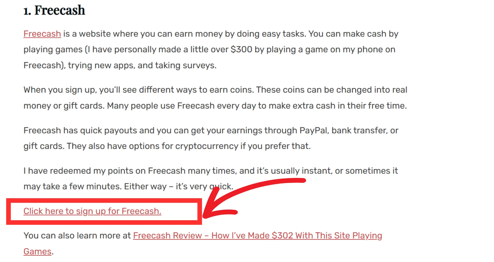
Here’s what works:
- Place a CTA near the beginning to catch skimmers.
- Add one in the middle after delivering value.
- End with a strong CTA that ties back to the post.
Make it blend naturally with the content. No one likes a salesy interruption in the middle of an article.
2. In Email Campaigns
Email subscribers are already interested in what you offer. CTAs in emails should guide them to the next step—whether that’s making a purchase, signing up, or learning more.
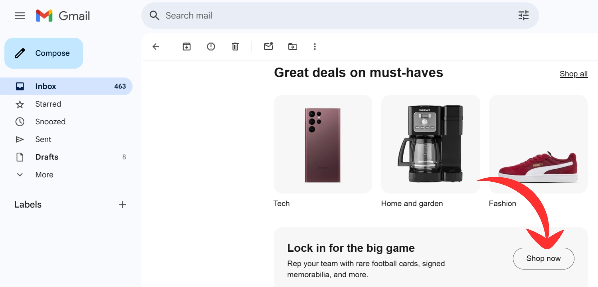
Best CTA placements for emails:
- At the top, so readers see it first.
- In the middle, reinforcing the message.
- At the end, paired with a closing statement.
Use simple, action-driven language like “Grab Your Free Guide” or “Start Earning Today.” Test different placements to see what gets the most clicks.
3. On Landing Pages
Landing pages are designed to convert, and a weak CTA placement can ruin that. You need a clear, visible CTA that tells visitors what to do next.
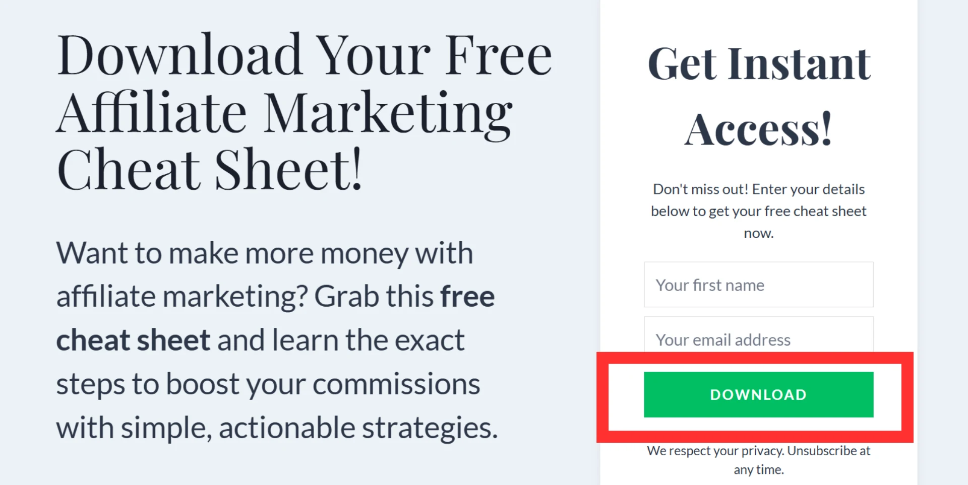
Here’s how to get it right:
- Place the main CTA above the fold (visible without scrolling).
- Add supporting CTAs throughout the page for longer content.
- End with a final CTA that drives home the message.
One strong CTA works better than multiple competing ones. Make it easy for visitors to take action.
4. Social Media Posts
People scroll fast on social media, so your CTA needs to be direct and engaging. A strong CTA can turn a casual browser into a buyer.
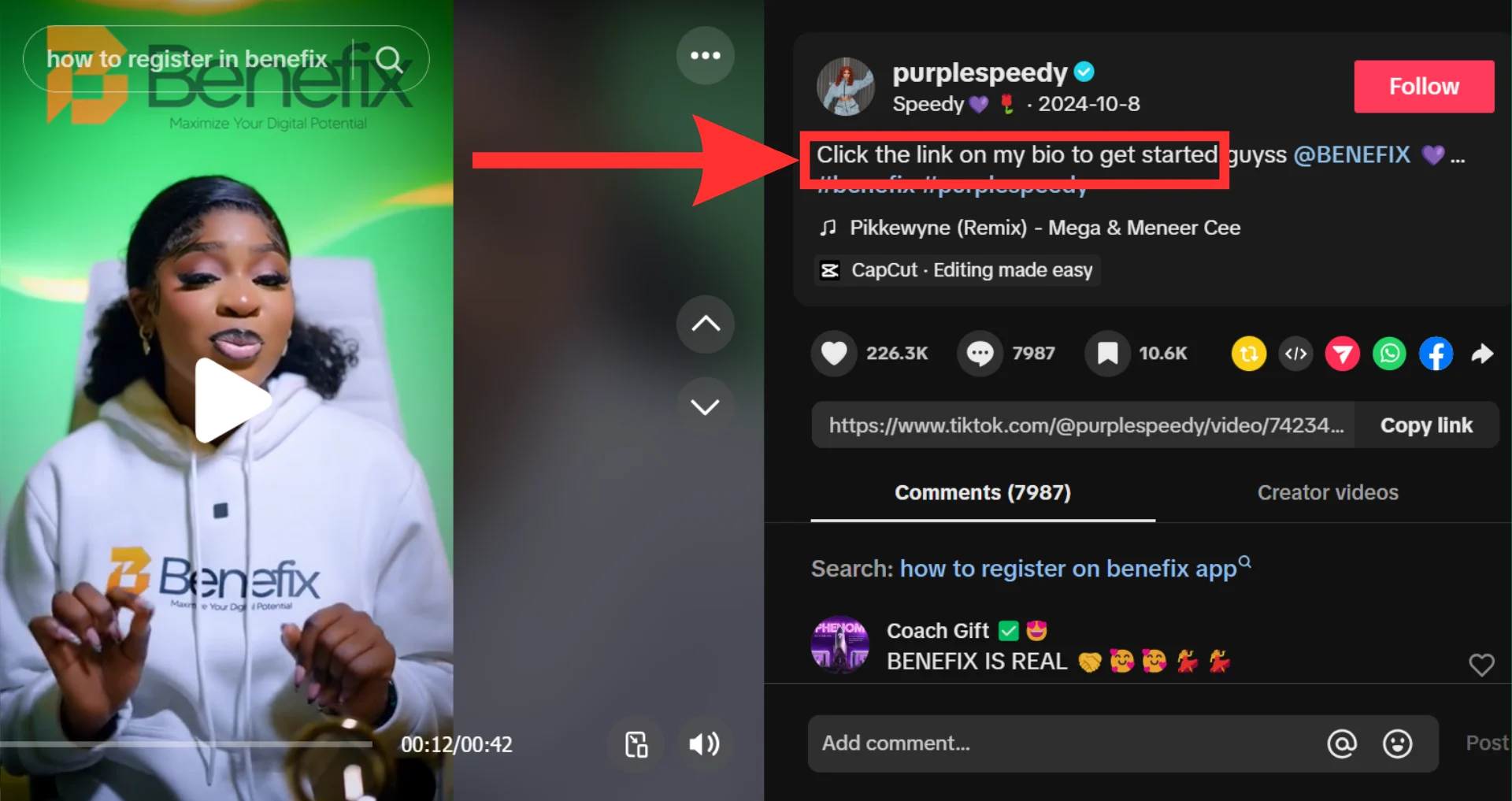
Best practices for social media CTAs:
- In post captions: “Click the link in bio to get started.”
- In stories: Use stickers and buttons for instant engagement.
- In comments: Pin a CTA for extra visibility.
Social media users aren’t always looking to buy, so make sure your CTA feels natural and offers value.
5. Pop-Ups and Exit Intent Offers
Pop-ups can be annoying when done wrong, but when done right, they work. A well-timed pop-up or exit-intent offer can grab attention and drive action.

Here’s what works:
- Offer something valuable: “Get 15% off before you go!”
- Time it right: Don’t hit visitors with a pop-up the second they land.
- Keep it simple: One message, one action.
Test different pop-up styles to see what works best for your audience. Some respond to discounts, while others prefer free guides or limited-time offers.
A strong CTA isn’t just about wording—it’s about where and when it appears. If people don’t see it, they won’t act. Place your CTAs where they feel natural, test different spots, and adjust them based on performance. A small change in placement can make a big difference in conversions.
Common Mistakes to Avoid with CTAs
A call to action (CTA) can make or break conversions. Many affiliate marketers get this wrong, missing out on clicks and sales. Here are common CTA mistakes and how to avoid them.
1. Being Too Vague: If your CTA isn’t clear, people won’t click. A phrase like “Click Here” tells them nothing. Instead, be specific. Say, “Get Your Free Guide” or “Claim Your Discount.” Make it obvious what they’re getting.
2. Weak or Passive Language: Your CTA should inspire action. “Submit” or “Enter” sounds dull. Stronger options like “Get Started,” “Try for Free,” or “Shop Now” work better. People respond to urgency and clarity.
3. Hiding Your CTA: If users have to hunt for your CTA, they won’t bother. Place it where it’s easy to see. Above the fold, within content, and at the end of blog posts are great spots.
4. Using Too Many CTAs: More options don’t always mean more clicks. Too many CTAs confuse people. Keep it focused—one primary action per page is best.
5. Ignoring Mobile Users: If your CTA isn’t mobile-friendly, you’re losing traffic. Buttons should be large enough to tap, and text should be readable. Test your site on different devices.
6. Skipping A/B Testing: Guesswork doesn’t work. Small tweaks to wording, colors, or placement can change everything. Run A/B tests to see what performs best.
7. Not Creating a Sense of Urgency: People procrastinate. If your CTA doesn’t push them to act now, they won’t. Add urgency with phrases like “Limited Offer” or “Only a Few Left.” It gives them a reason to act immediately.
8. Forgetting to Explain the Benefit: People don’t care about the button; they care about what they get. Instead of “Sign Up,” say “Sign Up and Get 20% Off.” Give them a reason to click.
9. Poor Color Contrast: Your CTA should pop. If it blends into the background, it’s useless. Use bold colors that stand out, like red, green, or orange.
10. Not Following Up: A CTA is just the start. If someone clicks “Join Now,” they should land on a smooth, easy-to-use page. If they get lost or frustrated, they’ll leave. Make sure the next step is seamless.
CTAs aren’t just buttons or links. They guide your audience and drive action. Avoid these mistakes, test what works, and keep improving. A strong CTA means more clicks, better conversions, and higher commissions.
Conclusion
A strong call to action (CTA) isn’t just a suggestion—it’s the final push that turns interest into action. Without a clear CTA, people may read your content, browse your offers, and then leave without doing anything. That’s a missed opportunity.
Affiliate marketing depends on action. Whether you want readers to sign up, click a link, or buy a product, you have to tell them exactly what to do. A vague or weak CTA won’t cut it. You need direct, action-driven words that make taking the next step easy.
But placement matters too. The best CTA won’t work if no one sees it. Smart marketers place CTAs where they feel natural—inside blog posts, on landing pages, in emails, and across social media. Testing different placements and styles helps you figure out what works best for your audience.
Affiliate marketing success isn’t just about traffic—it’s about conversions. And conversions start with a strong, well-placed CTA. Keep testing, keep refining, and make sure every piece of content leads people toward the next step. That’s how you turn passive visitors into engaged buyers.
Frequently Asked Questions
What is a CTA, and why does it matter in affiliate marketing?
A CTA (Call to Action) is a direct prompt that tells users what to do next, like clicking a link, signing up, or making a purchase. In affiliate marketing, CTAs drive engagement and conversions. Without them, visitors may not take action, leading to missed opportunities and lost revenue.
What are the key elements of a strong CTA?
A good CTA is clear, direct, and persuasive. It should:
Use action-driven words like “Get,” “Try,” or “Claim.”
Create urgency with phrases like “Limited Time Offer” or “Only a Few Left.”
Stand out with bold colors and readable fonts.
Be short and specific, leaving no confusion about what happens next.
Where should I place CTAs for the best results?
CTAs work best when they’re naturally integrated into high-traffic areas, including:
Blog posts – Insert CTAs within or at the end of relevant content.
Emails – Include CTAs in newsletters and promotional messages.
Landing pages – Make the CTA the main focus to drive conversions.
Social media – Use CTAs in captions and posts to boost engagement.
Pop-ups – Time them well to capture attention without being intrusive.
How can I make my CTA more effective?
To improve your CTA’s impact:
Keep it short and clear—avoid vague wording.
Add a benefit-driven message (e.g., “Get 20% Off” instead of just “Click Here”).
Use contrasting colors to make it stand out.
Test different placements and styles to see what works best.
How do I track the performance of my CTAs?
Use analytics tools to measure:
Click-through rate (CTR) – The percentage of users who click your CTA.
Conversion rate – How many people complete the desired action.
Bounce rate – If users leave without engaging, your CTA may not be strong enough.
Regular testing and adjustments help improve performance over time.
Can a bad CTA hurt my affiliate marketing success?
Yes. A weak CTA can confuse visitors, reduce clicks, and lower conversions. If users don’t know what to do next, they likely won’t do anything. A clear, engaging CTA ensures they take action, leading to better results and higher earnings.


